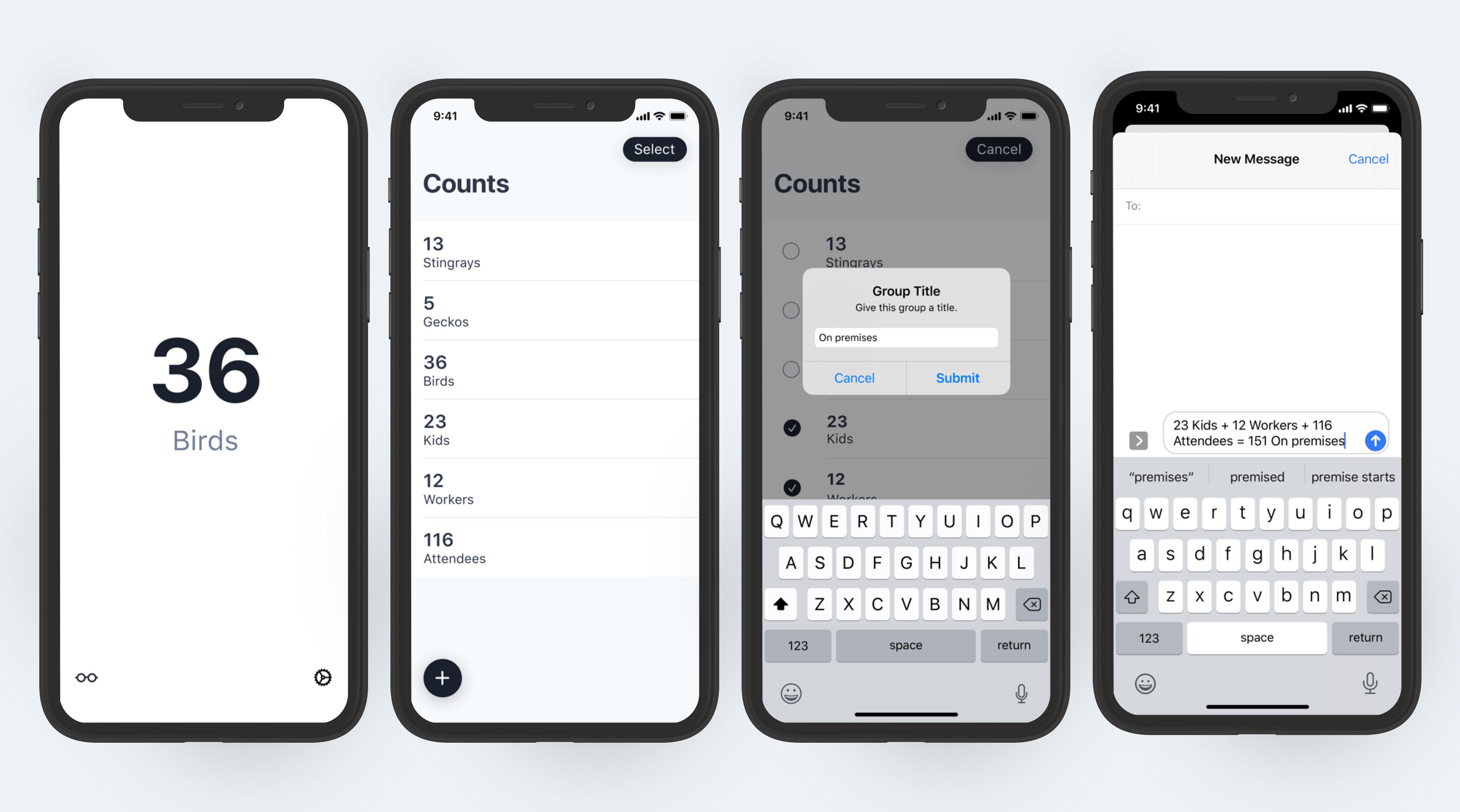
Project summary

Work - What I did

Researched a recurring task with the view of improving the experience. Analyzed my findings and identified what I believed the new solution should accomplish. Designed and developed the solution.

Output - What I delivered

  • An outline that captures the background, research, analysis, and a brief story of the customer's situation, anxieties, and what they hope to achieve
  • A prototype (link goes to Vimeo demo video)
  • An iOS app (no longer available in the App Store)

Outcome - What that achieved

Outline replaces many documents and guides thinking. Several pain points are removed or smoothed over. More accurate and consistent counting data.

Impact - What changed

Improved forecasting for meeting attendance. Recording of lesser known attendees (visitors, mothers with small children, etc.)

Project details

My role: I was the sole person working on this app.

Methods and Skills: UI Design, UX and Interaction Design, research, Figma, Xcode

Table of contents

  1. Situation & Problem
  2. Observing Behavior & Interviewing
  3. Desired Outcome
  4. Solution
  5. Ideation & Sketching
  6. Visual & Interaction Design
  7. Conclusion

Situation & Problem

I'm tasked with counting and recording people. I also share those numbers with others via text message.

Moving targets are hard to count and interruptions can force a re-count. Existing tools require a free moment for the eyes, brain, and fingers.

Observing Behavior & Interviewing

I followed other count takers around and observed their behavior. Here's what the counting process looked like:

I interviewed count takers regarding their behavior and the products they currently use and have used in the past.

Desired Outcome

Defining success with a short story:

"When it's my turn to report the number of kids and workers on the playground and I’m worried I’ll get distracted and forget the numbers before I record them, I want to count and record at the same time, so that I can move on to other tasks."

Solution

Create a counter app that allows me to count without looking away.

Ideation & Sketching

Braindump & Cluster

I wrote down everything that I believed the app needed to be and accomplish. This became a list of items that I grouped into clusters.

UI Flows

Sketched out a rough schematic of how the customer interacts with the system. It also lets me refine the clusters and discover new clusters.

Sketching Screens

Initial sketches using typical pattern found in similar apps - 2 buttons for increasing and decreasing the count, a title for the count, and the current count.

Choosing a pattern

This UI pattern satisfies the "Counting" cluster identified during the ‘Brain dump & cluster’ phase.

Visual & Interaction Design

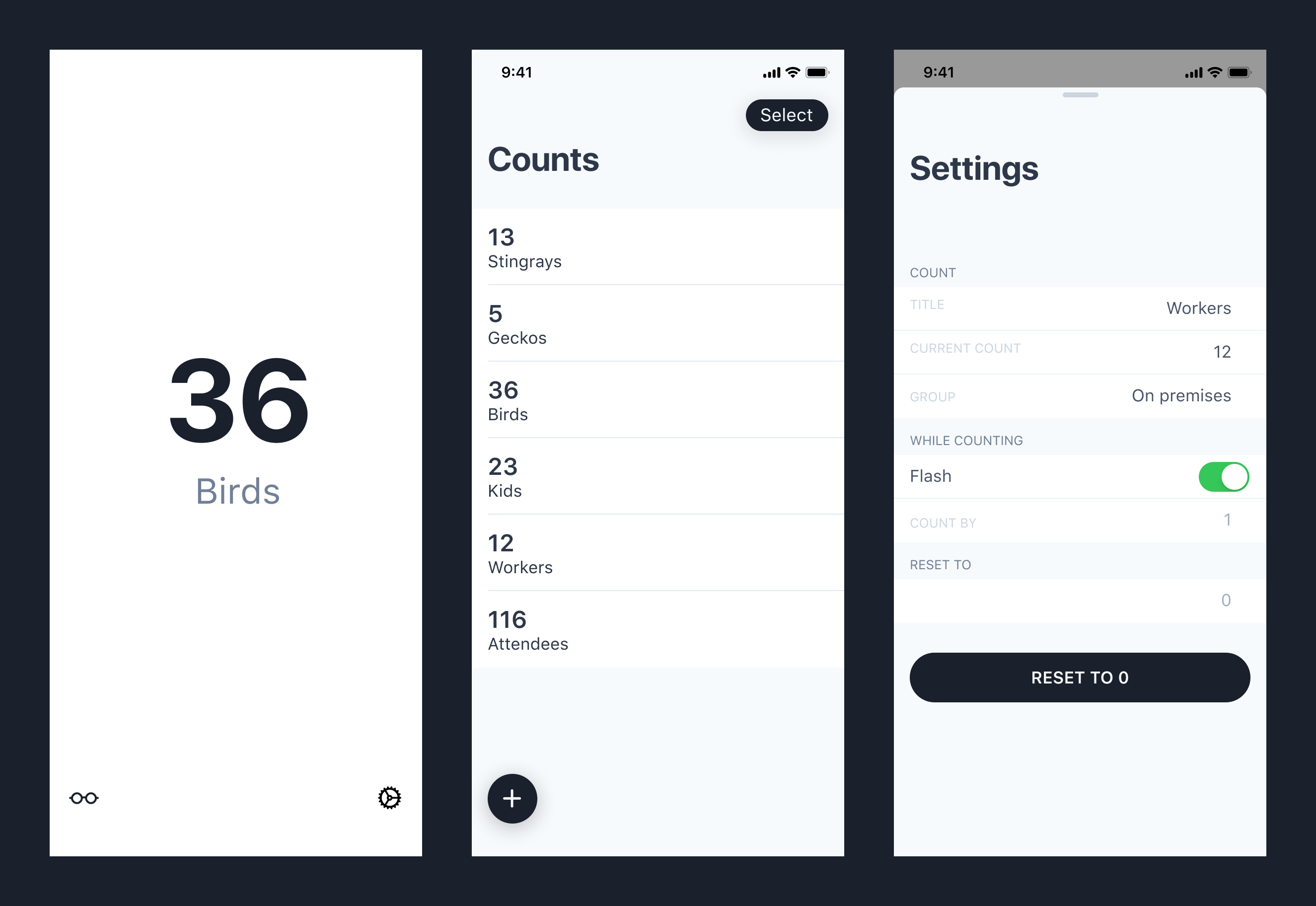
Counting, viewing counts & adjusting settings

Tap to increment. Swipe down to decrement. The screen flashes with each tap or swipe. I created a prototype to test how this interaction felt.

The flashing can be turned on/off in the settings.
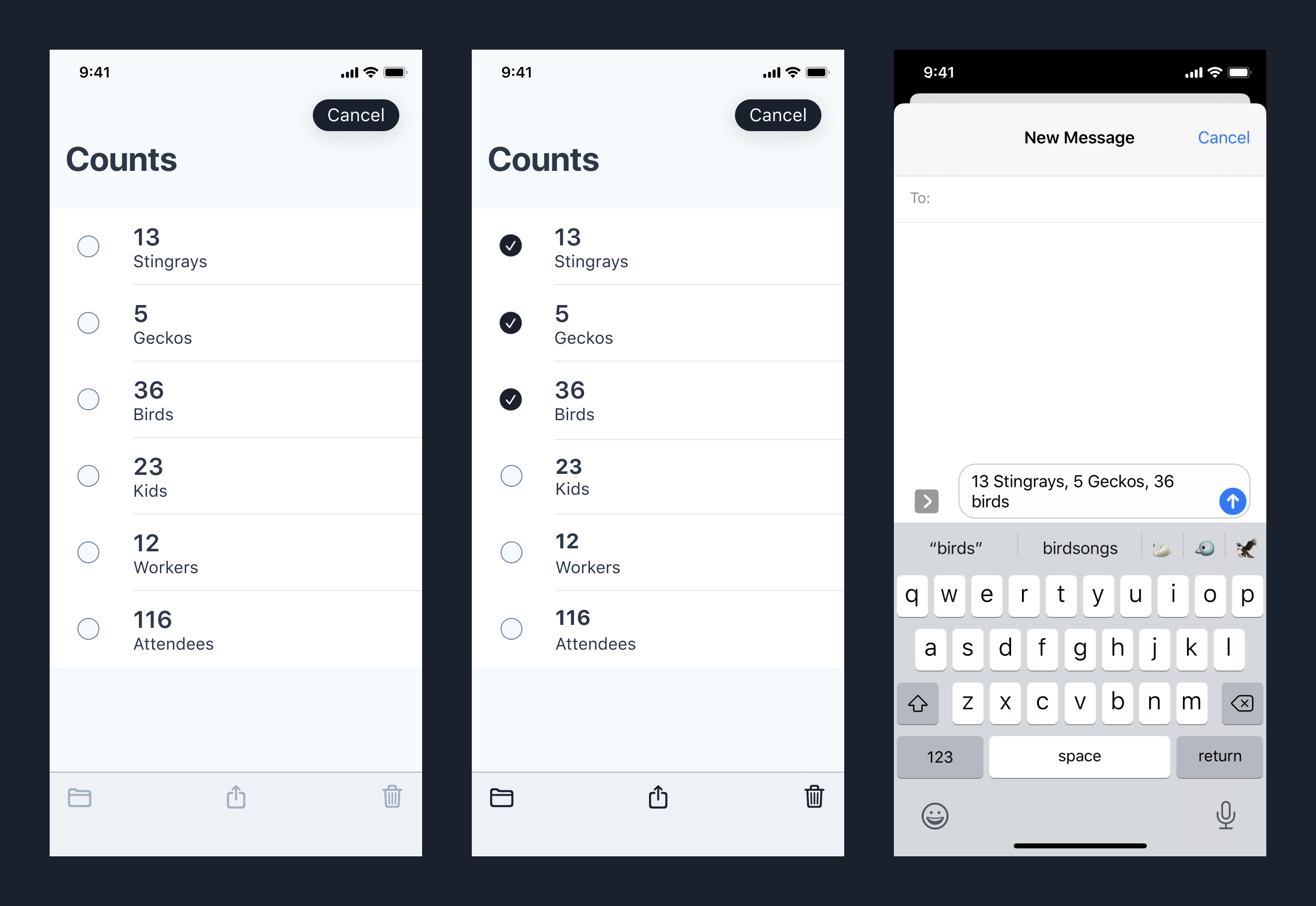
Sharing counts

Sharing counts creates a pre-formatted text message that includes the count title and value.
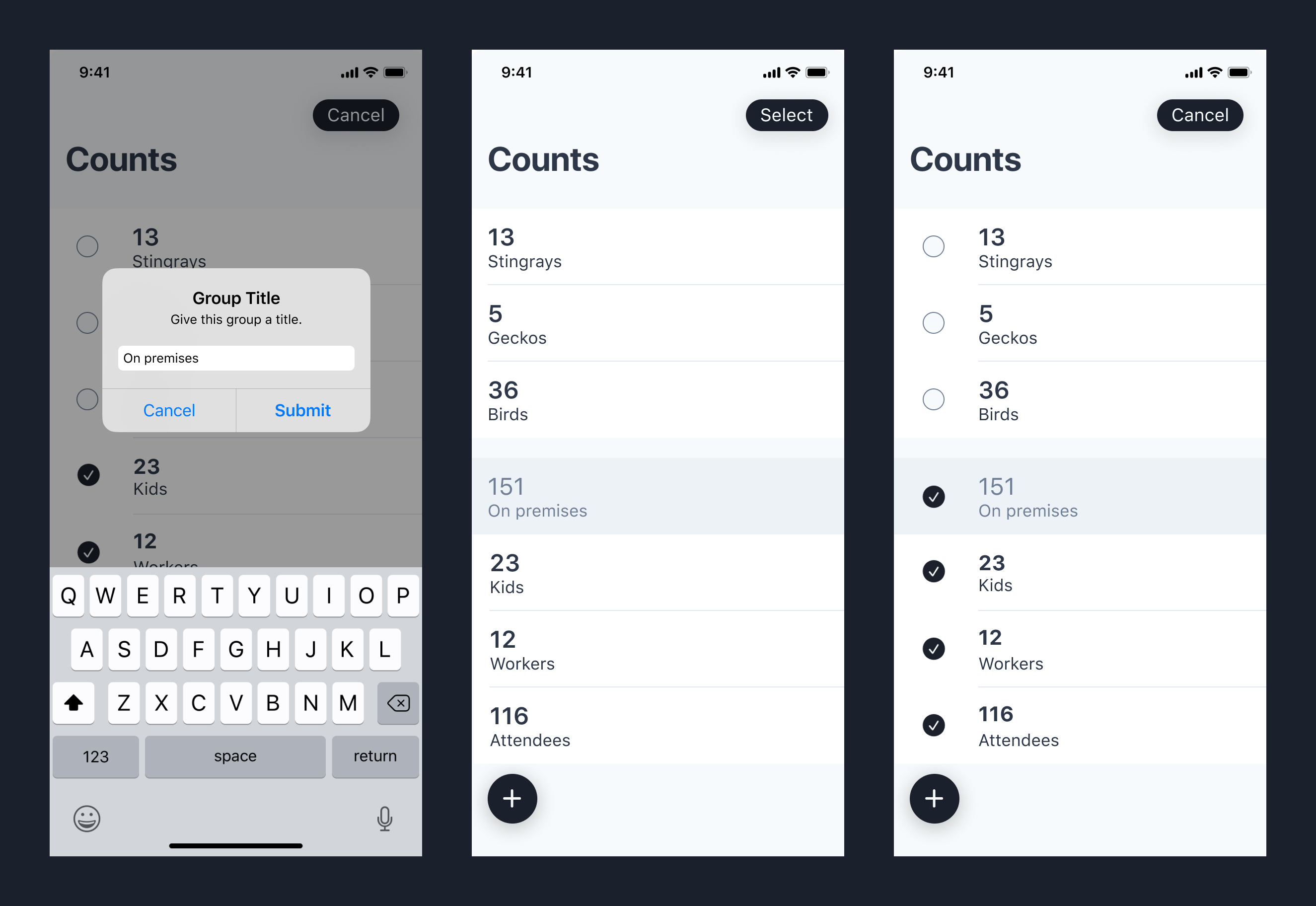
Grouping and sharing counts

Counts can also be grouped. Changing one count will change the group's total count.
Conclusion

I set out to create a solution that satisfied this story:

"When it's my turn to report the number of kids and workers on the playground and I’m worried I’ll get distracted and forget the numbers before I record them, I want to count and record at the same time, so that I can move on to other tasks."

This app gave me a new way to make progress on a recurring life situation. Prior to using the new solution, I had assumed that counting and recording were necessarily 2 separate steps, i.e. “that’s just the way it is”.