Contrast, Perception
Consciously using contrast and least effective difference
"Use contrast to get attention, use copy to change what the viewer knows".
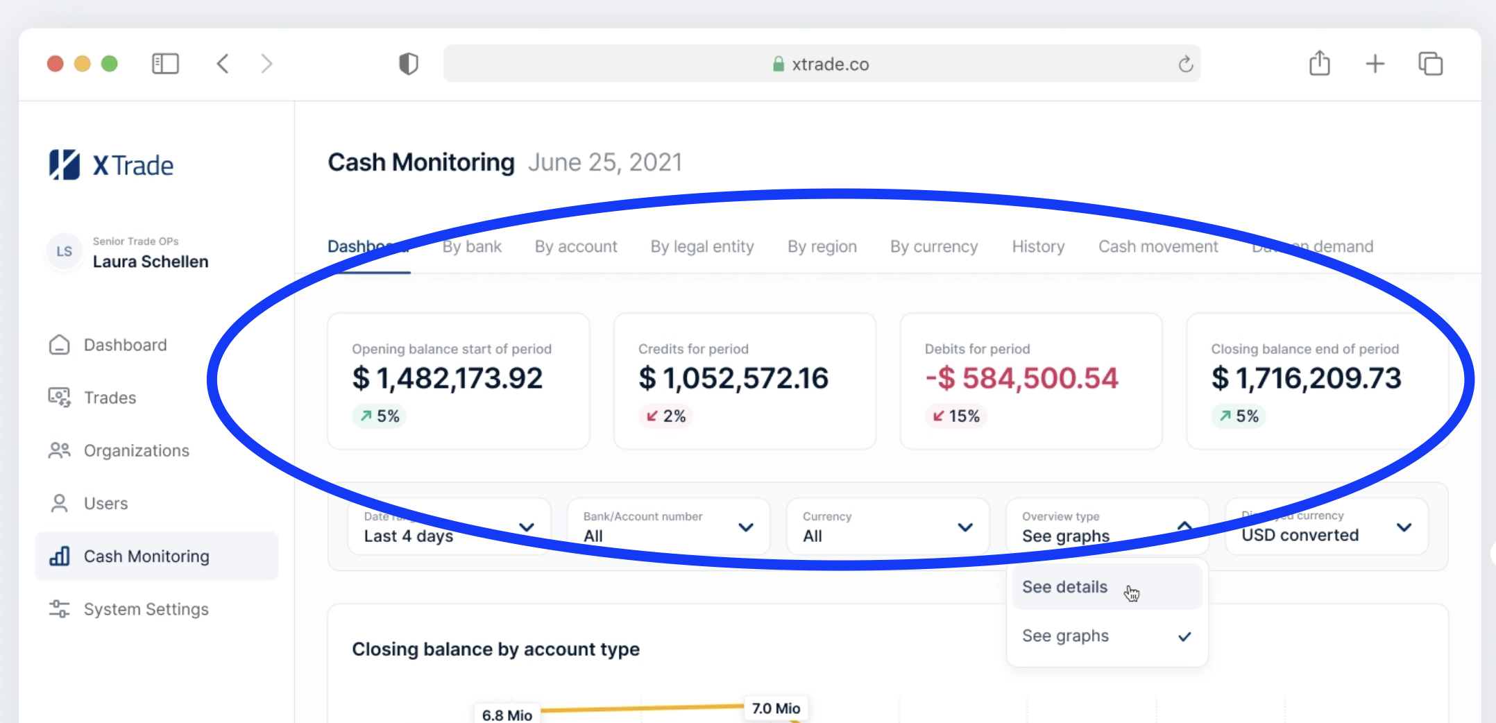
Example of "consciously using contrast"
The red amount is just enough contrast to tell you something is wrong. The designer consciously chose to make the other amounts black instead of green, which would have resulted in too much contrast.

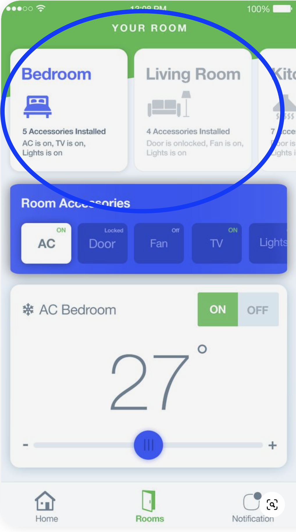
Example of "least effective difference"
The highlighted "Bedroom" tab catches the eye. The gray color of the neighboring tabs is the least difference that can be made to distinguish the active and inactive tabs.

References
To learn more, see the work of: