Typeface Quiz
Designing and building a Typeface quiz. Give the quiz a try.
Overview
The Font Quiz is a project that I came up with during the 4th week of studying JavaScript according to this this schedule. The quiz tests your ability to identify 10 different system and web fonts.
This project falls in line with Jason Fried's advice to make something for yourself.
What's the Problem Being Solved?
I wanted to build a typography quiz that helped my eyes focus on the anatomy of a specific font. I've tried other typography quizzes, but none did this for me. They simply displayed some text, styled in a particular typeface, and asked the user to identify the typeface. I wanted to create a quiz that explained the defining characteristics of the typeface in question.
Designing the System
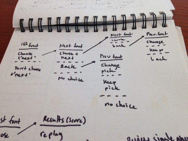
I had a general idea of how the quiz taker would flow from choosing a quiz on the home page, to answering questions and ending on the final page where they receive their score. I used a shorthand for UI flows to sketch out the system.
Designing Interaction
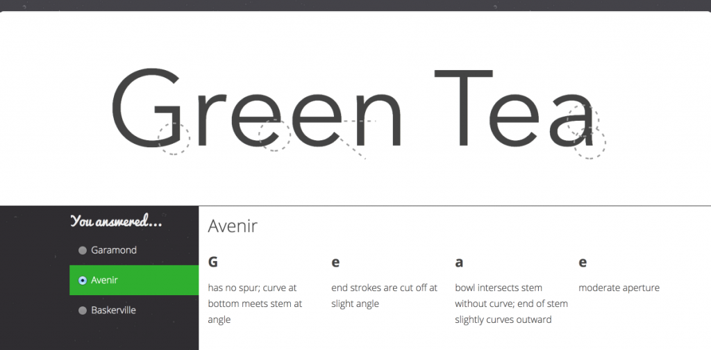
After sketching flows, I began sketching screens. I started with the question view:
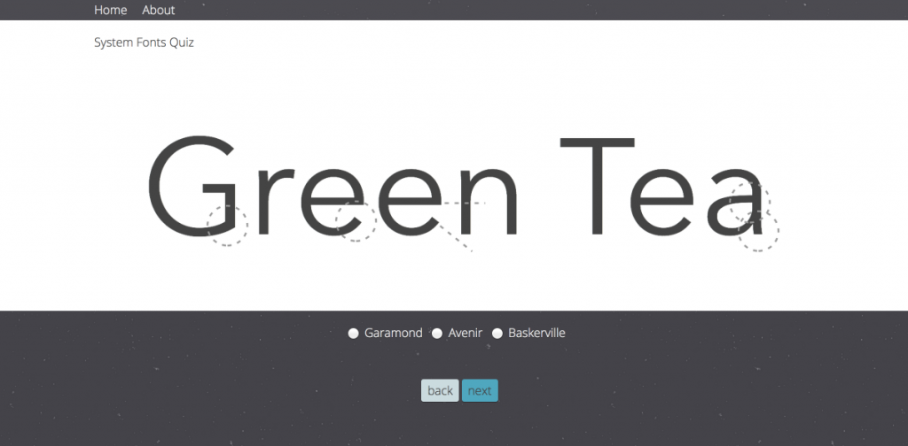
I started here because this is a screen that quiz takers must succeed at in order to progress to the end. It's also the simplest screen (fewer elements pointing to other aspects of the domain) that allowed me to think about how the quiz works and where data is coming from.
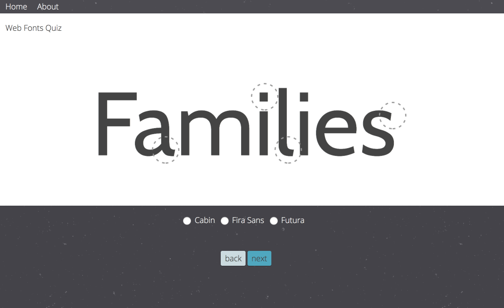
Starting with the epicenter
I started my design work with the most important part of the screen (the epicenter). This screen seems to be 90% epicenter - the giant word typed in a specific font and the answer choices - but I decided the epicenter was the giant word and more specifically the 'highlighting' of that word's anatomy. I explored a few options before landing on the dashed circles and lines. There are probably more clever ways to do it, but this approach did the job and allowed me to move forward with the design.
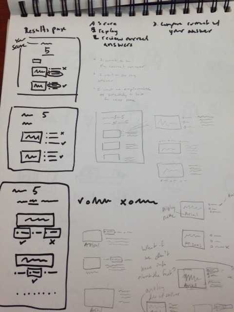
Final Score Page
Quiz takers enter through the home page, go through a series of question screens, and end on the final score page. What would I expect to see after I answered the last question?
For me, it was the following:
- my score
- my answers
- the correct answers
- some explanation for each answer
- my options for where to go next
- some indication of how awesome I am (or not)
- I don't want to travel to other pages to satisfy these points
- how I did compared to other quiz takers
The last point seemed beyond the scope of the project (probably good for version 2). Taking the previous points into consideration, I again started with finding the epicenter and working outwards.
The most important part of the screen was the score. I wanted to make it a large number or percentage, but decided against that idea since I think percentages are only good when a large number of various types of question are involved. Using the "5 out of 5" approach works well because there are only 5 questions and each question is basically asking the same thing: what font is this?
The "review your answers below, replay or take another quiz" sentence addresses the second most important question: "Where do I go from here?".
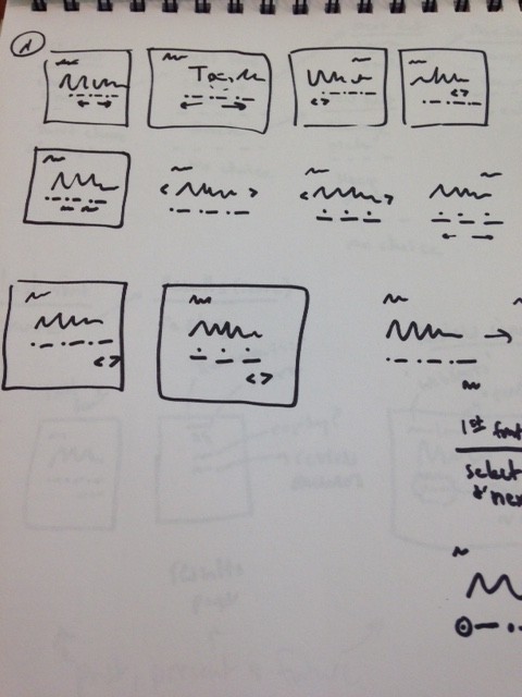
The "review your answers" section was the third most important part of the screen and it gave me the most trouble.
In considering the context surrounding this review section, I came up with a list of questions/concerns/forces that I felt the design had to resolve:
- What is the correct answer to this question?
- What was my answer?
- I want to know almost immediately whether my answer was right or wrong
- I want some explanation for the answer
The elements and their arrangement on screen form the pattern that I settled on after several iterations. Below are my sketches of those iterations:
Home Screen Copy
I wanted to focus on clarity and making the copy work for it's place on the screen. I re-wrote the sentence on the home page "Take the System or Web Fonts Quiz" many times. I didn't want to rely on two big buttons or something 'graphical' that was labeled "System Quiz" or "Web Fonts Quiz". Using a single sentence also allowed me to focus on getting the point across as quickly and clearly as possible. For example, one iteration of the sentence said "Take the System Quiz or Web Fonts Quiz", from which I cut out the repetitive use of the word "quiz".
Conclusion
I made the decision to focus on the early steps in the interface design process and reserve styling for later. I've tried the opposite approach - focusing on things like color, typography, etc. and trying to make things look great from the start - but that always delayed project completion and left important problems unsolved. I think this helped me focus on the purpose of the project.
I can see this quiz evolving into a web app that allows for more interaction. I'd like to allow quiz takers to move the dashed circles and lines or create their own. I built this quiz to learn some JavaScript and scratch an itch. This was a great experience exercising my design muscles to build something for myself.
Give the quiz a try
References:
http://blazdesign.com/20-fonts-every-designer-should-know
http://practicaltypography.com/system-fonts.html
http://typographywinter2014.blogspot.com/2014/01/type-anatomy-connor-posey.html
http://www.marksimonson.com/notebook/view/how-to-spot-arial
http://www.fonts.com/content/learning/fontology/level-1/type-anatomy/anatomy
http://www.typographydeconstructed.com/category/anatomy-of-type